Work With Pro Sign Designers: Show Your ‘True Colors’ In Conroe, TX
For some buyers, choosing sign colors is seen as something of an afterthought, but sign designers know better. As shown in multiple marketing studies, color psychology is a powerful promotional tool, allowing us to:
● Break through the noise and differentiate your marketing message from the competition
● Convey meaning and brand personality without words
● Creating eye catching contrast and improve sign legibility distances
● Trigger deep visual and semantic encoding for better brand recall and recognition
● Influence the moods and feelings of individual buyers, and more!
If you need help choosing the best colors for your brand or marketing message, today’s post is for you. Read on to review some data driven design tips from color psychology studies, and find out how we make it easy to create the perfect promotional palette, or call The Custom Sign Haus at (936)-539-4200 to speak directly with our sign designers in Conroe, TX.
How To Incorporate Color Psychology Into Your Sign Design
1. Use Colors That Align With Your Brand Personality Or Offerings
85% of respondents to the American Shopper Study agree that signs can “convey the character or personality of the business,” and to that end, color is king!
Colors convey different moods, feelings, and meaning, more so than text and images, and when you choose one that aligns with your brand’s personality, you can greatly enhance the impact of your intended message and positively influence the way your signs are perceived.
For example, in one report for Management and Labour Studies, Singh & Srivastava (2011) found that agreement between brand personality and palette triggered deep “inferential processing in the brain,” which strengthened the intended message and resulted in higher levels of brand recall and reader satisfaction.
So how do you find the right color for your brand? Our sign designers make it easy. After getting to know a bit about your business, we can walk you through the entire color spectrum and explain every option, or recommend a palette based on your unique brand personality.
For example, a landscaping company would do well to incorporate green into their brand palette, since this color is typically associated with nature, grass, and green thumbs. Conversely, a wealth management company might do best with gold and silver—the colors of currency—as well as royal purples, no-nonsense neutral tones (e.g. black, white, and gray), or cooling blues.
To discuss your options in full, get in touch with our in house sign designers.
2. Use Bright Colors To Draw The Eye To Your Marketing Message
In one study by the Journal of Consumer Psychology, researchers used eye tracking technology to find out which colors drew the most attention in busy retail spaces. Perhaps unsurprisingly, the authors found a “visual saliency bias” for brighter colors—in other words, the brighter the sign or packaging, the more likely the brand was to be noticed.
We can use this data to make our signage more conspicuous, especially in crowded signscapes. And you don’t need to limit yourself to primary colors or deviate far from your existing brand palette, as our sign designers can play with shading and hue to create eye-catching vibrance and intensity with any colors you like.
3. Choose Complementary Colors That Create Conspicuous Contrast
“The contrast between a sign and its immediate background is the primary determinant of one’s ability to detect the sign, perhaps more than size,” writes James Bullough (2017) in a report for the Interdisciplinary Journal of Signage and Wayfinding.
With that in mind, we should always be looking to create contrast, both internally, within the sign design, and externally, with our surrounding environment. One of the easiest ways to do so is to consult a basic color wheel:
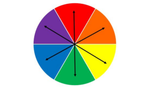
Contrasting colors, also known as complementary colors, are those found in the opposing segments. Thus, if blue is your brand’s dominant color, you can use orange as an accent or font color to create excellent contrast. We can also use the color wheel to create external contrast—for example, if your building is made from ruddy red brick, green signs would really stand out.
Of course, you do not need to limit yourself to the color wheel. White works great for creating contrast between dark reds, purples, blues, and greens, and black pairs perfectly with yellow.
To dig deeper into color theory and find the best option for your sign, get in touch with our in-house sign designers.
Work With Pro Sign Designers: Show Your True Colors In Conroe, TX
To help you brand with flying colors, The Custom Sign Haus offers:
● Free consultations with our in house sign designers, putting a wealth of experience, graphic design expertise, and color psychology insights at your fingertips
● Powerful color printing capabilities, giving you access to the complete color spectrum for limitless custom creations
● Perfect color matches with existing designs or brand marketing materials, thanks to our sophisticated spectrophotometer technology
● A wide selection of colorful materials, including acrylic, PVC, ACM, Coroplast, and more
To explore our sign catalog, discuss your options, and get a free quote on any order, you can:
● Call (936)-539-4200
● Email Hello@CustomSignHaus.com
● Fill out our quick contact form to book your consultation online
References
Bullough, J. (2017). Factors affecting sign visibility, conspicuity, and legibility: Review and annotated bibliography. Interdisciplinary Journal of Signage and Wayfinding, 1(2), 2-25.
Milosavljevic, M., Navalpakkam, V., Koch, C., & Rangel, A. (2012). Relative visual saliency differences induce sizable bias in consumer choice. Journal of Consumer Psychology, 22, 67–74.
Singh, N., & Srivastava, S. K. (2011). Impact of colors on the psychology of marketing—A Comprehensive over view. Management and Labour Studies, 36(2), 199-209.
Back